Accessible Instructional Materials & Course Sites
ED TECH SPOTLIGHT
quote Heading link
To continue to learn about making your course materials and site more accessible schedule an instructional design consultation for guidance and advice.
text Heading link

How do you remove barriers to students learning and provide the most access to your instructional materials and course site? Consider implementing the following practices from Web Content Accessibility Guidelines (WCAG) and Universal Design for Learning (UDL) to make your course more accessible to students.
The following quick wins will help ensure that information is perceivable (perceivable from WCAG and representation from UDL):
- Use accessible fonts, sizing, and spacing, including:
- Sans-serif or serif fonts
- 12 pt. for regular text in documents or course sites
- 1.5 spacing of text
- 2 spacing between paragraphs of text
- 16 to 18 pt. for slide text
- Create or select documents that use text aligned to the left margin (avoid fully justified text).
- Limit the use of red or green text only.
- Use more than just color to convey meaning. For example, use bolded or key terms to signal to students that text should be read in replace of or in addition to using color:
- The text you want students to read.
- Important: The text you want students to read.
- Ensure that graphs or diagrams utilize more than just color for the coding of information. If color is only used in a diagram, then provide an explanation of the data represented by color only.
- Provide alternatives for images used in student-facing content (documents, slides, and course sites).
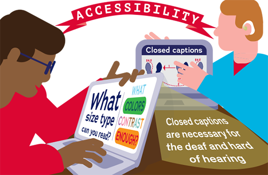
- Utilize Panopto or Echo360 for automatic closed captions for videos and recorded lectures.
The following quick wins will help ensure that information is understandable (understandable from WCAG and representation from UDL):
- Use descriptive language that explains what you mean instead of relying on jargon and idioms that may leave some students out of the conversation (e.g., “Not feeling well” instead of “Under the weather”).
- Provide the expanded version of an abbreviation each time you use it (e.g., this practice aligns with both Web Content Accessibility Guidelines (WCAG) and Universal Design for Learning (UDL).
- Provide definitions (and/or pronunciation) for unfamiliar terminology and/or resources on terminology specific to your field.
The following quick wins will help ensure that information is navigable and predictable (operable and understandable from WCAG):
- Utilize built-in headings and subheadings when creating documents, pages in the learning management system, slides, etc. (e.g., H1, H2, H3).
- Ensure that headings and subheadings are unique and support student understanding of the content that follows.
- If sharing hyperlinks with students, describe the link instead of providing a general click-here message, for example:
- Please click here to learn more about WCAG.
- Please visit the How to Meet WCAG Quick Reference Guide website to learn more about WCAG.
Want to continue to learn more about making your course materials and site more accessible? Consider scheduling an instructional design consultation for guidance and advice on your accessibility journey.
Want to learn more about accessibility and inclusive design? Consider enrolling in An Introduction to Accessibility and Inclusive Design (a four-week certificate program) from the University of Illinois at Urbana-Champaign. Please note you will need to be logged in Coursera and accept the invitation to enter the course.
Accessibility Resources from WebAIM
- Typefaces and Fonts
- Alternative Text
- Semantic Structure: Regions, Headings, and Lists
- Links and Hypertext
Schedule an instructional design appointment for one-on-one help and advice about making your courses accessible to all your students.